Style guides are basically a set of instructions explaining how common design elements should look, a visual cheatsheet of sorts. Not only can Sympli read and collect all styles in a design document (Photoshop or Sketch) and clearly display them for developers, but you can also create “Brandbooks” in the Sympli app, a shortened summary of your visual identity that can be derived from your style guides in Photoshop or Sketch.
I’ll take you through this from a Sketch standpoint, however Adobe users can adopt a similar workflow in Photoshop.
Why Even Have a Style Guide?
Great design is about maintaining consistency, and in larger designs especially, it can sometimes be difficult to remember the little details (and it’s the little details that matter!).
You might forget what font size your large headings (<h1>) should be, or what hex colour code your links should be on a light background. Rather than guessing, style guides can help you to keep this consistent. In fact, we can use the Shared Style feature in Sketch to help us do this. Let’s try it out!
How to Create Style Guides in Sketch
Shared Styles were massively improved back in Sketch 3.7. Not only can we now keep repetitive elements consistent, but we can create slight variations of them that are otherwise identical, allowing us to reuse styles in any scenario. Long story short, consistency is key, especially when handing the design over.
Start by creating a large custom-sized Artboard (we can use the “Resize to Fit” option later on) using the keyboard shortcut, A. When you’re done, create a separate text layer (T) for each of your text styles — these can be headings, lengthy content, menu items, small text and so on — and then design the different variations of your buttons (and other design components), taking into account the colours of your brand.
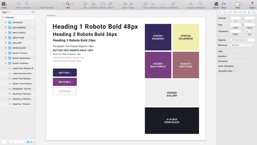
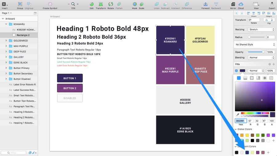
Don’t forget to save your common colours as “Document Colours” from The Inspector; this’ll make it much easier to select your repetitive colours when designing — again, for consistency.
Now that we have some idea of the visual aesthetic of our web design, we need to make these styles reusable for two very important reasons. Firstly, we’ll be able to make document-wide changes to common styles in an instant (because changes are inevitable, right?), and secondly, we can attach Shared Styles to our layers to automatically style them according to our guide. You won’t have to remember styles anymore and you certainly won’t have to waste your time doing it either.
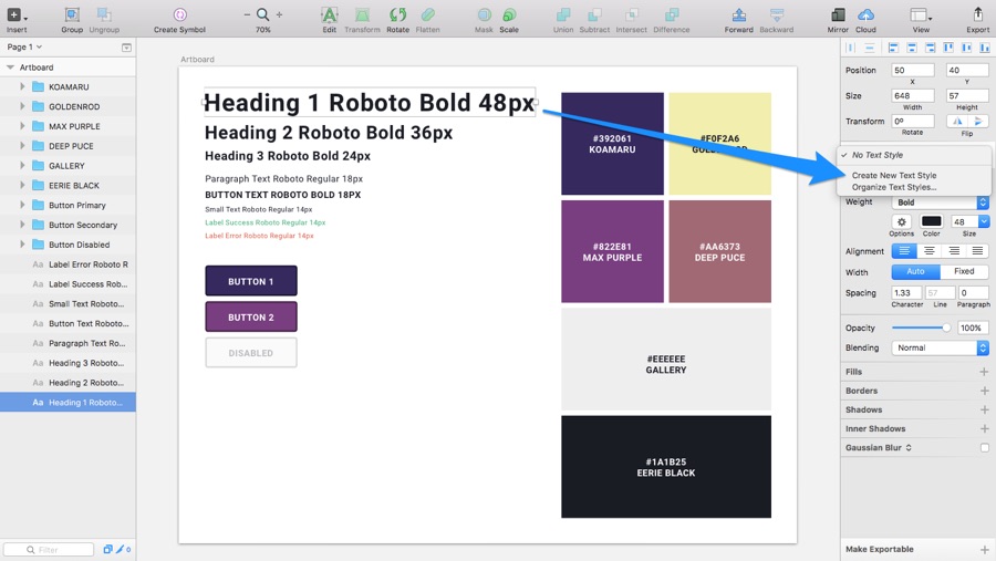
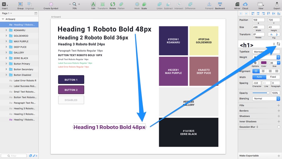
Lets test the workflow on one of our text layers. Select the largest heading, then “No Text Style” from The Inspector, then “Create New Text Style”, and then call it something descriptive like “<h1> [font family] [font weight] [font size]”.
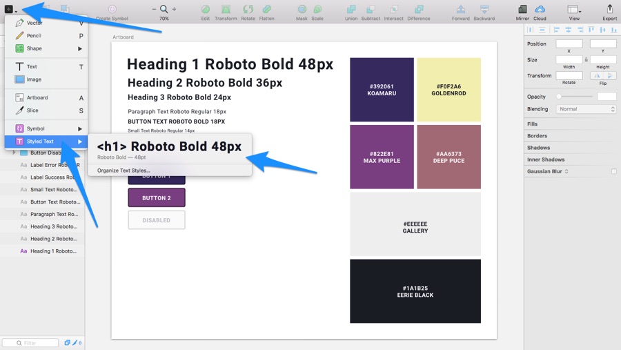
Now navigate to Insert ? Styled Text — this is how you can insert these already-made elements into your designs.
And if you need to make changes to this common style, simply do so and click the the “Apply to All” icon. When you click this icon, both the current text layer and the original large heading text layer will sync to the new changes; this is how we keep things consistent in Sketch when making changes to repetitive elements. If you want to keep both variations of the heading, simply don’t hit the Apply to All icon and leave it as-is.
How Developers Read Your Styles in Sympli
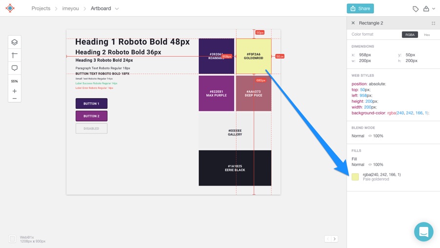
But how do these style guides benefit developers? Well, they’re the guys that have to convert these styles to code, so the fact that we’ve kept things simple and consistent has already helped them a huge deal. When you export the designs to Sympli, the styles can be read and even translated to native code from the Sympli app itself!
Let’s assume that I’ve made a design from this style guide and I’ve exported it to Sympli for developers to inspect.
How Brandbooks Can Help Developers Even More
But today however we’re going to take things a step further by creating Brandbooks. Essentially, this is your style guide in Sympli (because developers might not have Photoshop or Sketch).
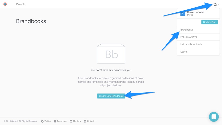
Start by selecting “Brandbooks” from the menu and then “Create New Brandbook”. Give it a name and click “Done”.
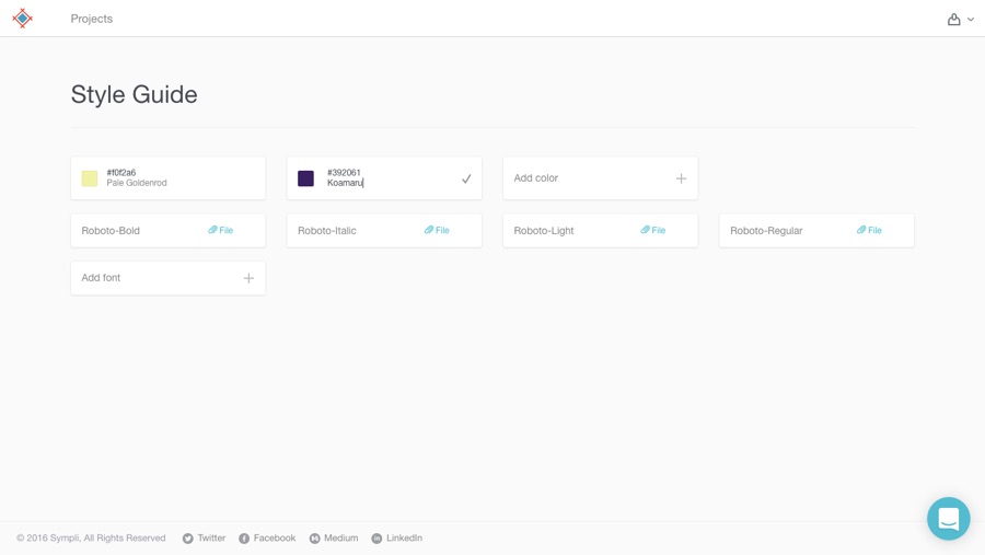
All that’s left to do is define the colours and fonts used in your design (make sure you click the save icon next to your input!). Developers can refer to this Brandbook to make note of the colours used and also download the fonts from there as well.
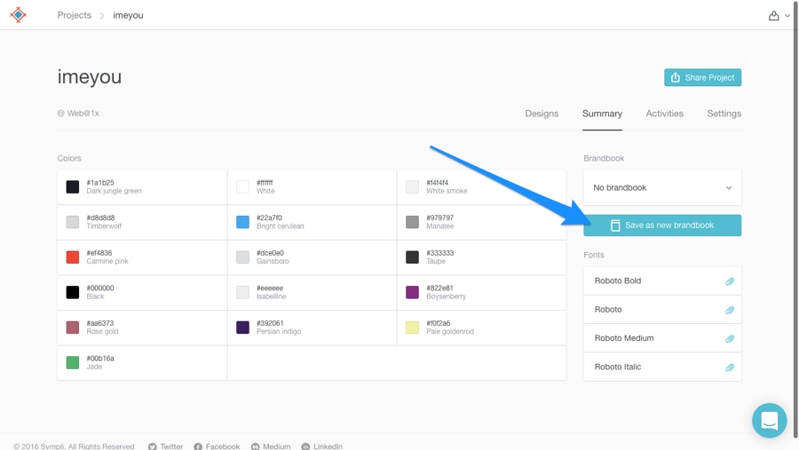
If you navigate to Projects > [Project Name] > Summary you can automate the process of creating a Brandbook, which basically extracts all of the colours and fonts used across your entire project (assuming it has more than one design file that is).
Just click “Save as new brandbook”!
Conclusion
Consistency makes a developers’ job much easier, and considerably reduces the amount of code required to build a website or app as well. In turn, this makes it perform better.
So even though designers aren’t directly responsible for the code side of things, their workflow can significantly impact the final result and this is why a smooth design handoff is absolutely necessary. Designers are also very picky, so if you’re a designer I’m fairly sure that it would be in your best interests to ensure that your designs are being implemented right down to the very last detail! Am I right? Wink.


