Just one negative experience with a product can cause users to seek alternatives. However, designers can’t craft great user experiences alone — developers are a crucial part of this process too, especially when it comes to performance and the inclusion of those that use alternative input methods such as keyboards and screen readers.
Additionally, UI design tools such as Adobe XD, Sketch and even Figma are still relatively underpowered despite their critical acclaim, which often leaves developers with the burden of having to guess how users would want interfaces to behave.
In this article we’ll look at the aspects of UX that developers tend to be heavily involved in and how designers can help with them. We’ll also discuss how product teams can use Sympli’s design handoff, not to bridge the gap between design and development but to eliminate it, bringing the two together properly.
Performance
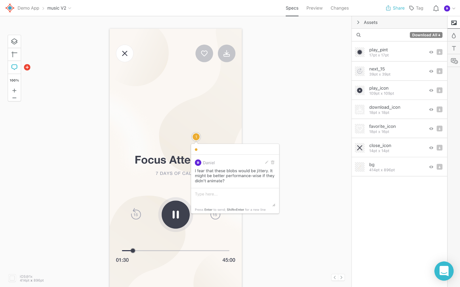
Performance impacts UX significantly, but although it’s the developer’s responsibility to ensure speed and reliability, this can prove to be impossible if the design is too complex.
For this reason, it’s important that designers hand off designs to developers regularly and as early as possible, as this allows developers to weigh in on their viability before designers commit to fully exploring them.

Accessibility
One of the most important aspects of UX, accessibility, is also one of the most overlooked. Designers only tend to focus on readability, legibility, labeling (but only to an extent) and color contrast (which requires a plugin) since UI design tools just aren’t up to scratch when it comes to accessibility, forcing developers to step in.
Some of the UX decisions that developers have to make include:
- Writing alternative text descriptions for images, alerts and statuses
- Writing accessible labels for unlabeled form controls, certain HTML landmarks and sections without headers
- Deciding the focus order for keyboard users
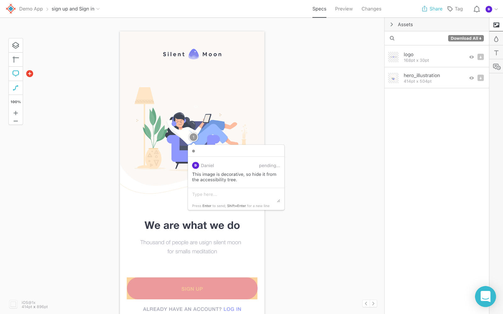
- Deciding which elements to hide from the accessibility tree

Responsive Design
UI design tools are getting more and more sophisticated when it comes to prototyping responsive layouts, however, they still require designers to create additional frames/artboards to demonstrate what designs should look like across different screen sizes. This practice isn’t ideal because it results in designers only creating two or three frames for each screen (desktop, mobile and maybe tablet), leaving the “in-betweens” up to developers.
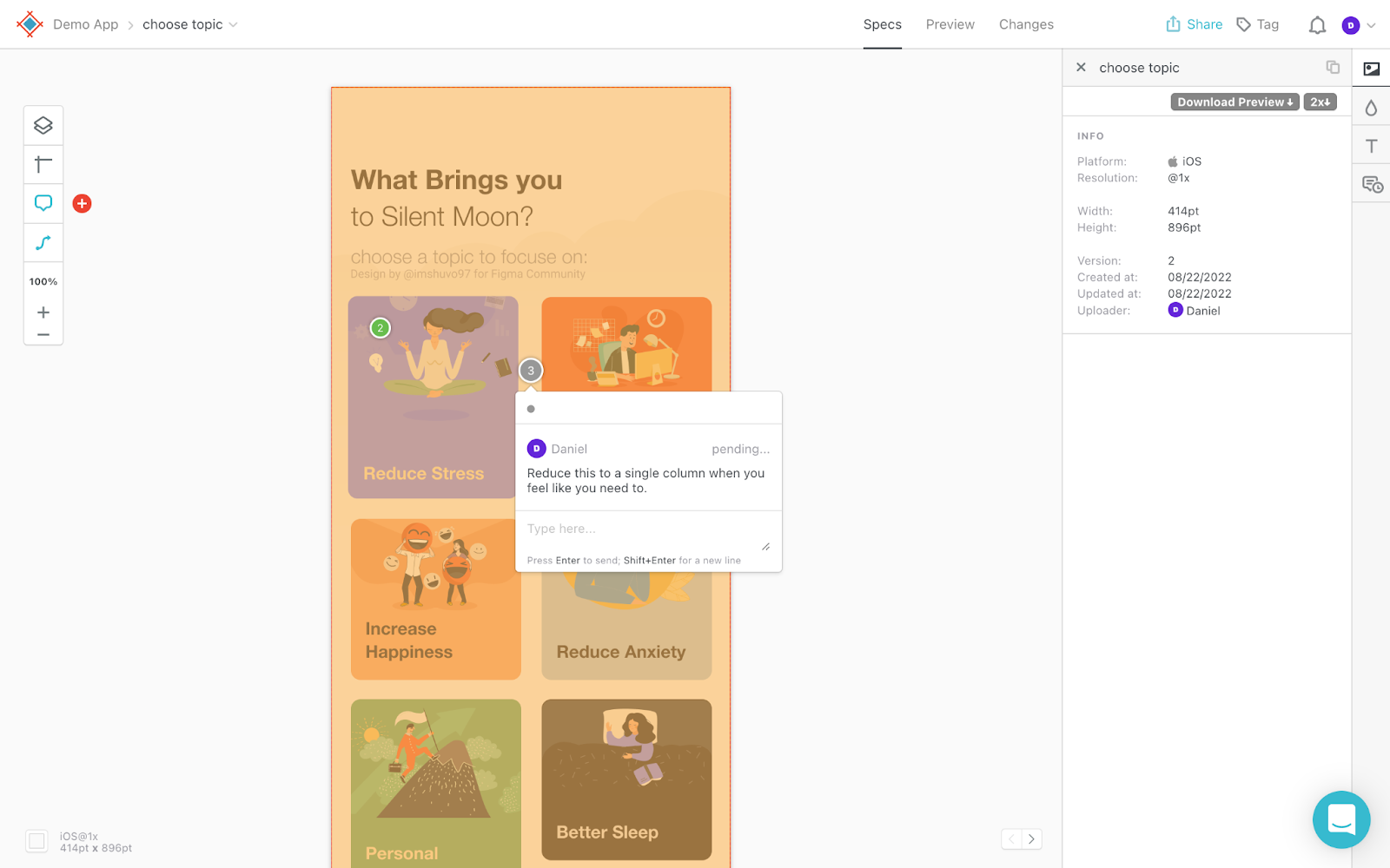
In most scenarios, developers will correctly assume that layouts should be fluid unless otherwise depicted, but design handoff annotations can still go a long way in clarifying how they should behave in certain edge cases.

Animations and Transitions
UI design tools have never been particularly good at enabling designers to prototype advanced animations and transitions, which means that interaction design often becomes the developer’s responsibility.
It’s only recently that UI design tools have made it easy for designers to prototype variants. This means that developers no longer have to improvise with the visual design of hover states and the like, but advanced animations and transitions are still very much a burden to developers unless designers adopt advanced prototyping tools such as ProtoPie into their workflow.
Either way, developers know which properties can be animated and are best equipped to estimate how performant animations would be, so whether designers are prototyping animations or just describing them, developers should have the opportunity to weigh in with their expertise.
Consider Using Net Promoter Score (NPS) Surveys
A low-key but effective way to gauge user experience is to conduct an NPS survey and then synthesize the results into a Net Promoter Score, which depicts how likely users are to recommend the product to others based on their experience with it. Just remember to include some qualitative questions asking respondents to explain the reasoning behind the score that they gave. This enables respondents to raise concerns about performance, accessibility or any other aspect of their experience that they feel could be improved.
Collaborate Using Sympli Handoff
How Sympli Handoff can help: When handing off designs using Sympli, designers and developers can utilize Sympli’s annotation features to contextually address/discuss matters of accessibility and responsiveness beyond visual design, not necessarily because developers don’t have the necessary knowledge of UX (because many do), but because it’s best to avoid baking UX decisions into production code without a design review.
Sympli Handoff doesn’t just facilitate handing off designs to developers, it also makes it incredibly easy to have in-context conversations about how to craft the best user experiences imaginable. By properly bringing together the expertise of designers and developers, product teams can take user experiences to the next level.


